
Deliveroo
Delivering a food icon to new markets
Food delivery no longer means pitiful pizza, bland burgers or crap kebabs; Deliveroo drops your favourite restaurant food on your doorstep. Deliveroo had seen huge growth but the market, and competition was hotting up.
They needed a new brand to unify their look, feel, and positioning as they moved into new markets. Deliveroo had global ambitions. They wanted to cement their place in a world of fast-growth startups, lead the market and give amazing restaurants a reason to stay exclusive.
In order to gain insight and understanding, we immersed ourselves in the world of Deliveroo by ordering and eating great food and becoming delivery drivers. We learnt that design was urgently needed to improve drivers’ safety on the road, and a new strategy could help bring a sense of community.
Brand Strategy
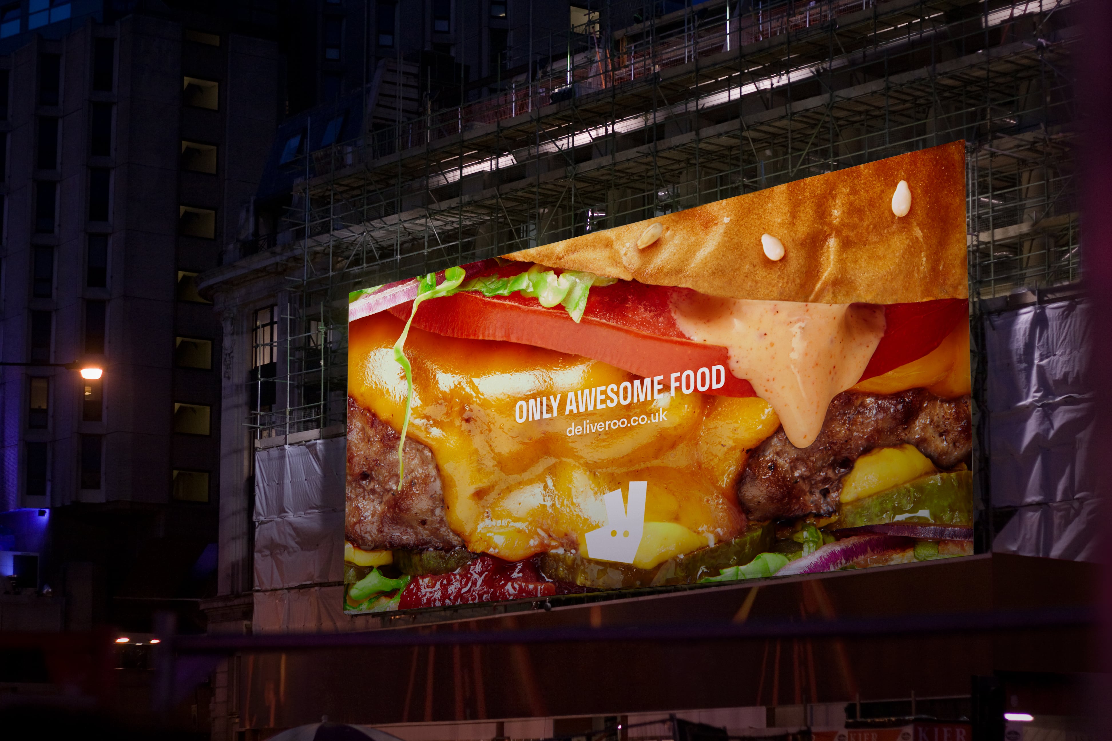
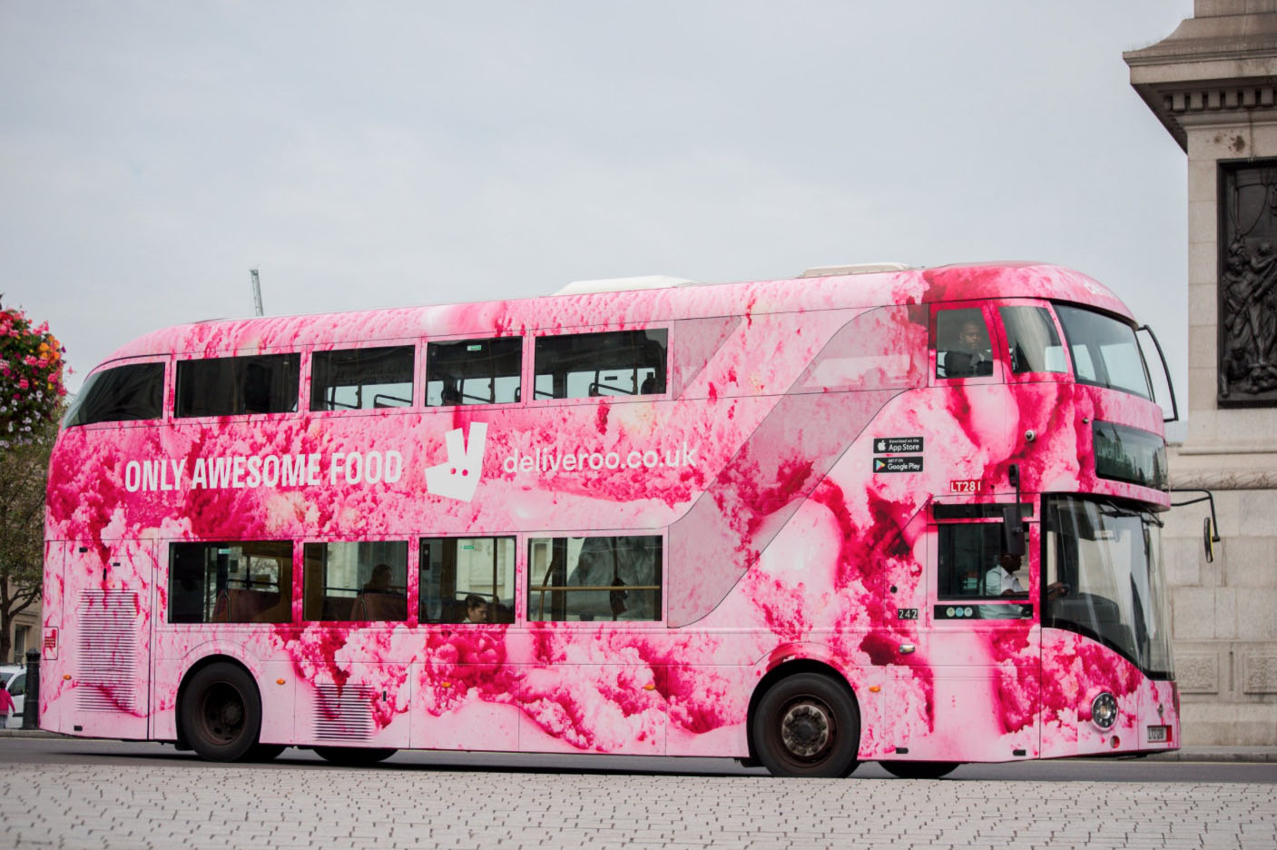
Our proposition was ‘Demand Awesome’; running with the brand’s fast-paced attitude, and unifying every one of their restaurants under the demand for their incredible food.

Brand Identity
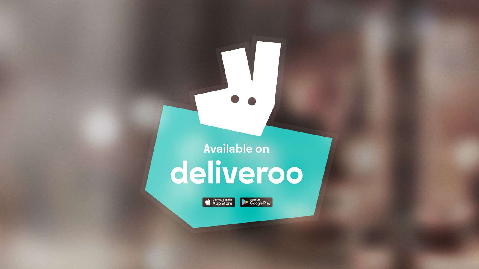
One of the brand's most recognisable assets, the Roo needed to stay. But with different connotations across Deliveroo's key markets, we needed to evolve it to make it abstract. We created a simplified version to become a true brand icon that stands out on every touchpoint, from the app to the most well-worn delivery rider's jersey. The angles of the Roo carry through the full identity system, inspiring angles of typography and pattern language for visual consistency.


Brand Expression
We created an incredibly visual brand that transcends language and different geographies. Instead of lots of copy, we introduced bold icons and defined a truly delicious food photography style, sparking natural incentive for restaurants to follow.


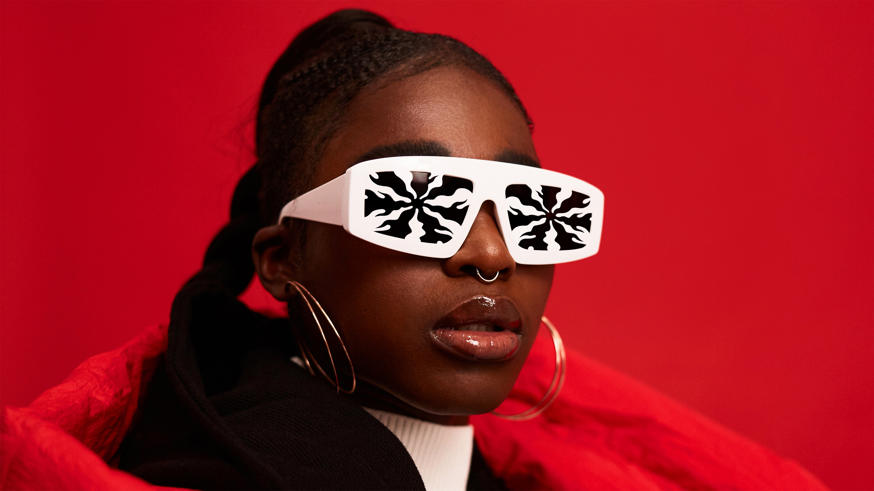
Our vibrant colour palette and visual system transformed the drivers’ uniforms and gave much needed visibility, especially with the introduction of flash material – only used by Nike at the time of concept development. Named a ‘streetwear must’ by the Guardian, our jackets made their way into pop culture through the likes of depop. The visibility of rider backpacks and merchandise design was also a key driver of customer acquisition.


“When I saw what you guys created, I was really blown away. It truly represents us and is so different from what others are doing.”
WILL SHU
FOUNDER AND CEO, DELIVEROO
Impact
We created an eye-catching brand that created consistency across 12 markets and 130 cities – with clever design that riders and customers love. Our work enabled Deliveroo to scale at speed, entering into new markets and ensuring a unified global brand as they grew.


.png)