
Wimbledon
Embodying the spirit of tennis’ grandest stage
Wimbledon has always been more than just a tennis tournament. Steeped in history, it is a symbol of heritage
and excellence where the world’s best battle on the sport’s most prestigious stage. Our challenge was to preserve the cherished British institution’s deep rooted traditions and amplify their spirit while evolving to resonate with audiences, old and new.
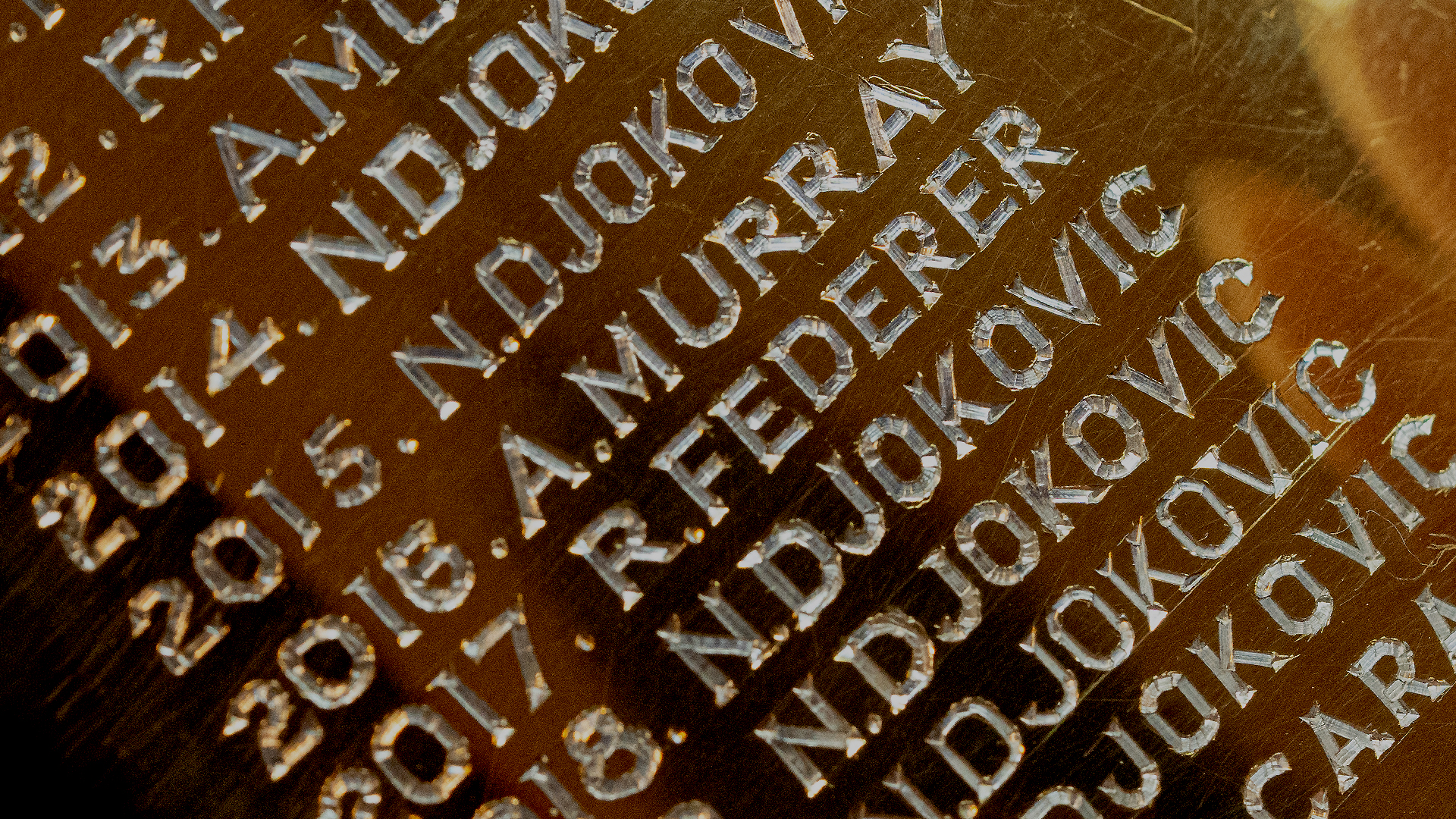
We immersed ourselves into Wimbledon’s rich history to discover what lay beneath the surface. Exploring meticulously kept courts, grounds and gardens, while discovering forgotten pieces from the library archives provided us with a rich tapestry of inspirational stories to live up to and surpass
what has gone before.


Brand Idea
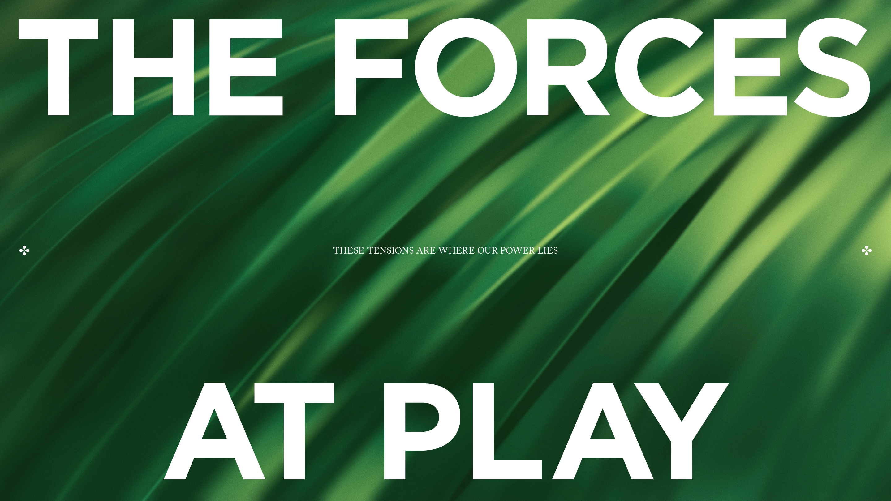
Encompassing the beautiful tension between opposing yet complementary elements that define Wimbledon is our brand idea, Forces at Play. Quietly understated, yet deeply passionate. Respectful of the rules, in love with the mavericks who challenge them. Timeless elegance meeting the unpredictability of live sport. This philosophy shapes every facet of the brand, ensuring Wimbledon remains both timeless and dynamic.

Employing a legacy
In order to truly preserve an iconic brand we explored ways to build on Wimbledon’s toolkit and create an identity that remains rooted in tradition and alive in the present moment.
This included a type system that could seamlessly adapt between moments of order and play. The iconic Wimbledon colours became the foundation for a vivid palette that drew directly from shades within the Wimbledon landscape to add depth and flexibility. Tone of voice principles embody the personality of the perfect host, inspired by the warmth and hospitality of the event to provide summer all year round.
.jpg)
Brand Expression
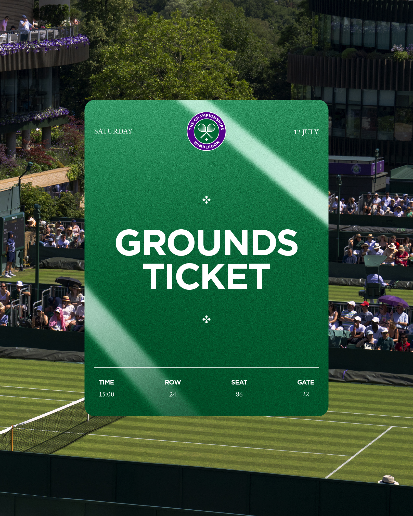
Placing grass at the heart of the identity celebrates its unmistakably unique role in the Wimbledon experience. Grass and court textures were introduced to highlight the tactility of the sporting experience, while expressive icons carry the kinetic form of a grass blade in the details of their forms. A floral point system nods to the abundance of iconic blooms around the grounds. The points represent the care, preparation and precision that goes into landscaping while adding structure to layouts.
.gif)
gif.gif)
.jpg)
.jpg)
The Championships
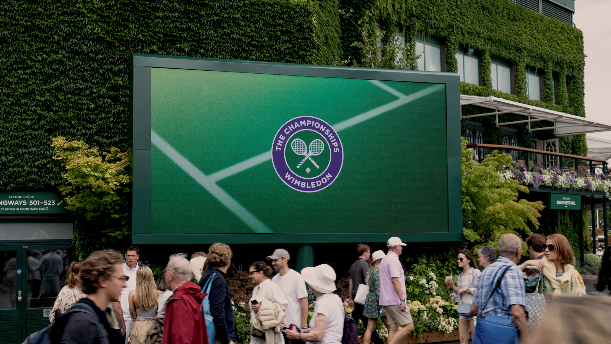
Unpredictability amongst the order. It was essential that the new brand had the ability to dial up and embrace this paradox, celebrating the high energy and unexpected drama that unfolds on its courts during The Championships.



.jpg)
Roll Out
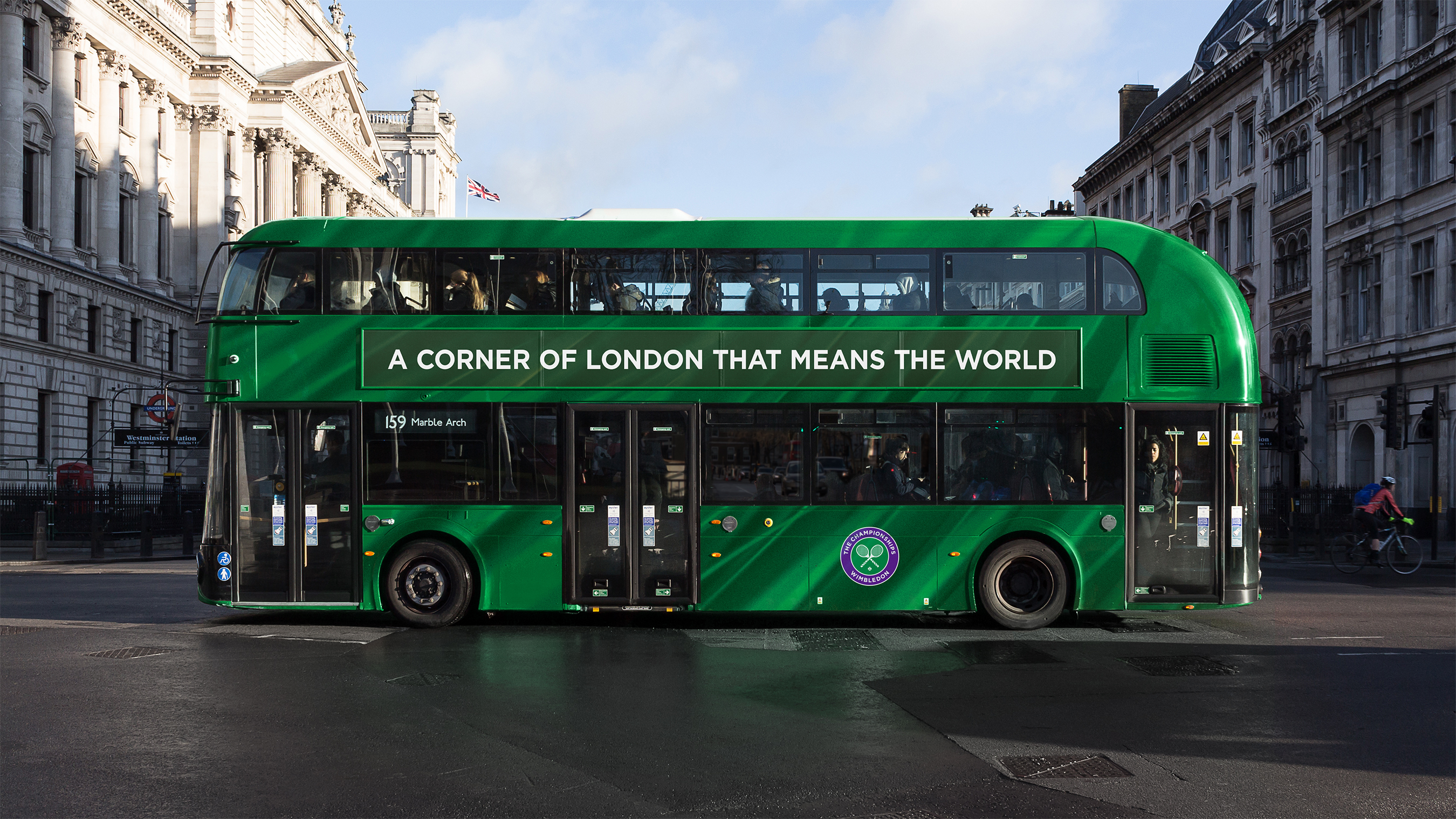
In a world where change is constant, Wimbledon’s ability to evolve while staying true to its essence is its greatest strength. Wimbledon’s legacy is its foundation, but it is never static. By drawing from its past, the brand continually redefines what it means to be the pinnacle of tennis, crafting stories that resonate beyond the sport itself.





SPECIAL THANKS
Further
CHRYS NASELOS
SAM CORNWALL
CHARLIE STUART
JULIAN POIDEVIN
KIRSTY DEACON
SOPHIE RICHARDSON
JULIEN QUEYRANE
SINEAD KIRBY
HAYDEN SHIELDS
LEAH RATCLIFFE



.png)