
HSBC SVNS
TRANSFORMING RUGBY INTO A GLOBAL FESTIVAL EXPERIENCE
World Rugby HSBC Sevens Series is renowned as a destination for great sport and partying for those close to rugby. Our brief was to reimagine what the Series could become through a new brand vision, evolving Sevens from a rugby tournament into an iconic global festival experience for both fans and non-fans around the world. Positioning it as the go-to destination for sport, entertainment and culture.
Strategy
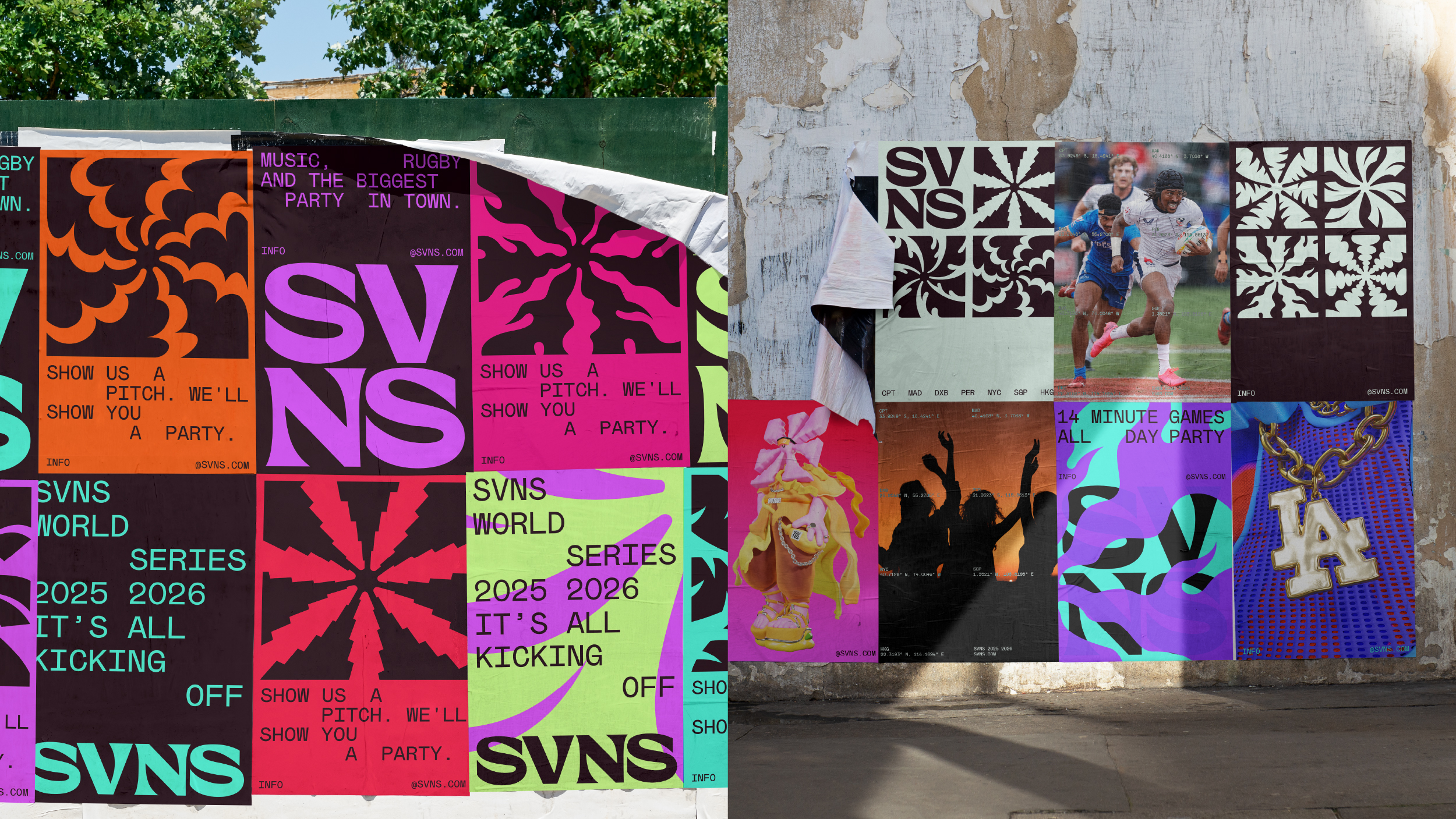
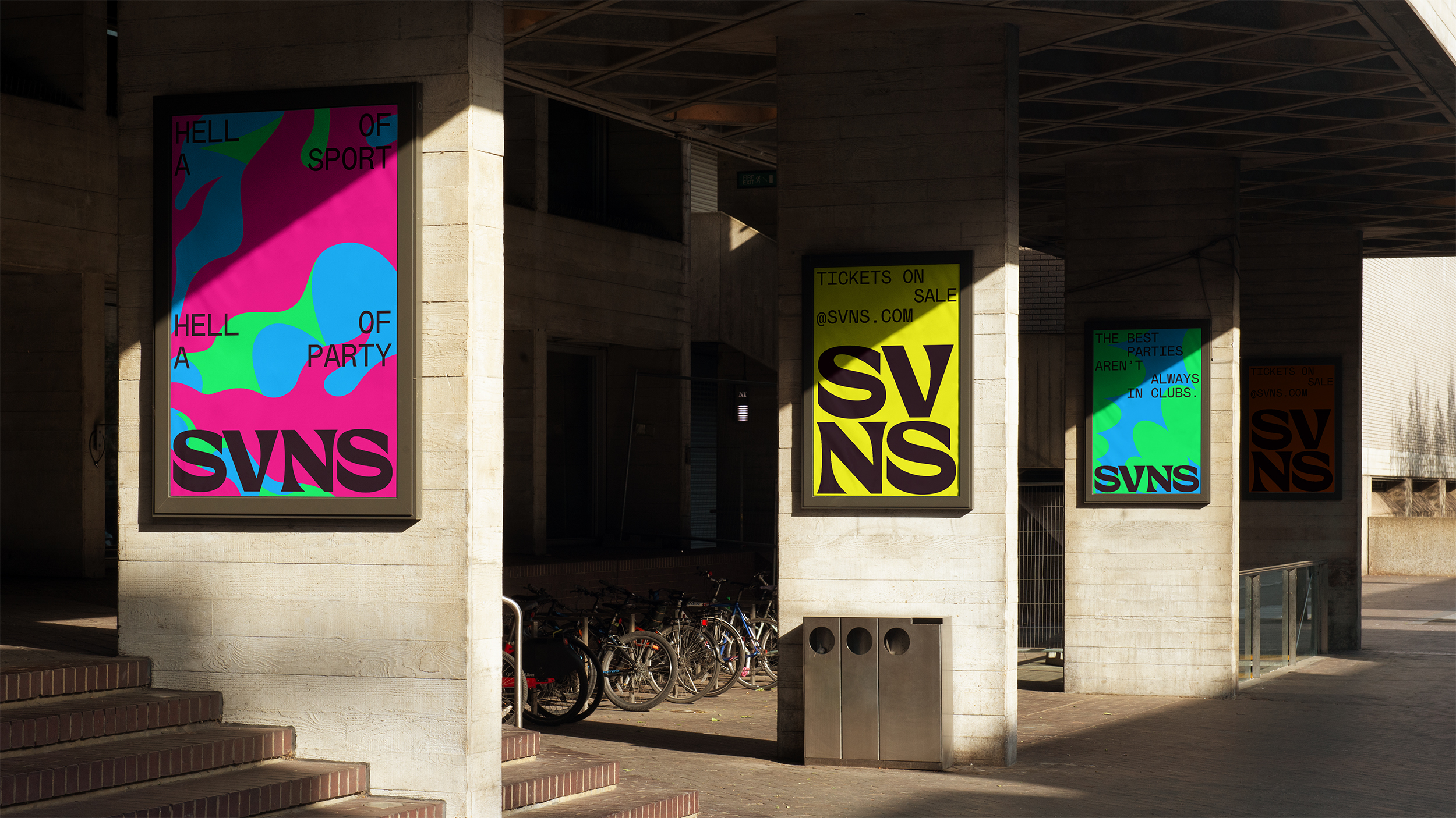
The tournament has one key thing that makes it different from anything else: Sevens is always following the sun. Taking place in summertime destinations across seven unforgettable months; from sun soaked days in Cape Town to buzz-filled nights in Dubai. The power of Seven doesn’t stop here. It’s inherent in the game itself, where teams are made up of seven players and matches are played over two, high-energy seven-minute halves. This became the inspiration for our strategic platform: Chase the sun. Live the rush.
As part of this exploration, the brand positioning and unique festival format of entertainment, culture and sport was imagined through three experience principals: Sunrisers, Sungoers and Sunsetters, which help frame how different audiences could engage with the series, setting the vibe, bringing the energy and ensuring every HSBC SVNS event ends on a high.
Once we had defined the brand strategy, we moved to naming. It was more an evolution than a complete reimagination. The name SVNS was proposed as a bold evolution of the Series name, keeping the brand recognition of the tournament while adding a playful energy that matches its new format.
Brand Expression
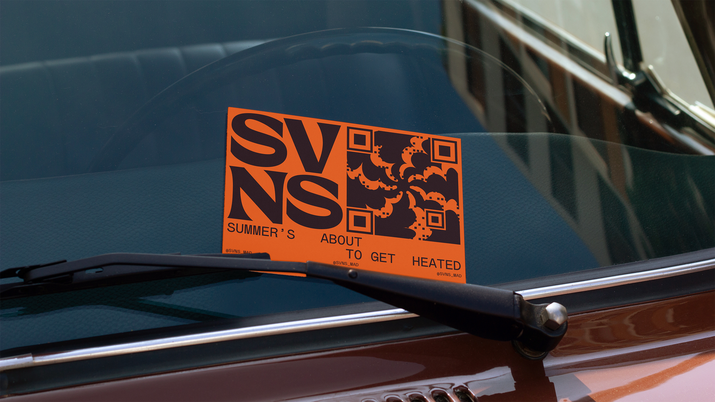
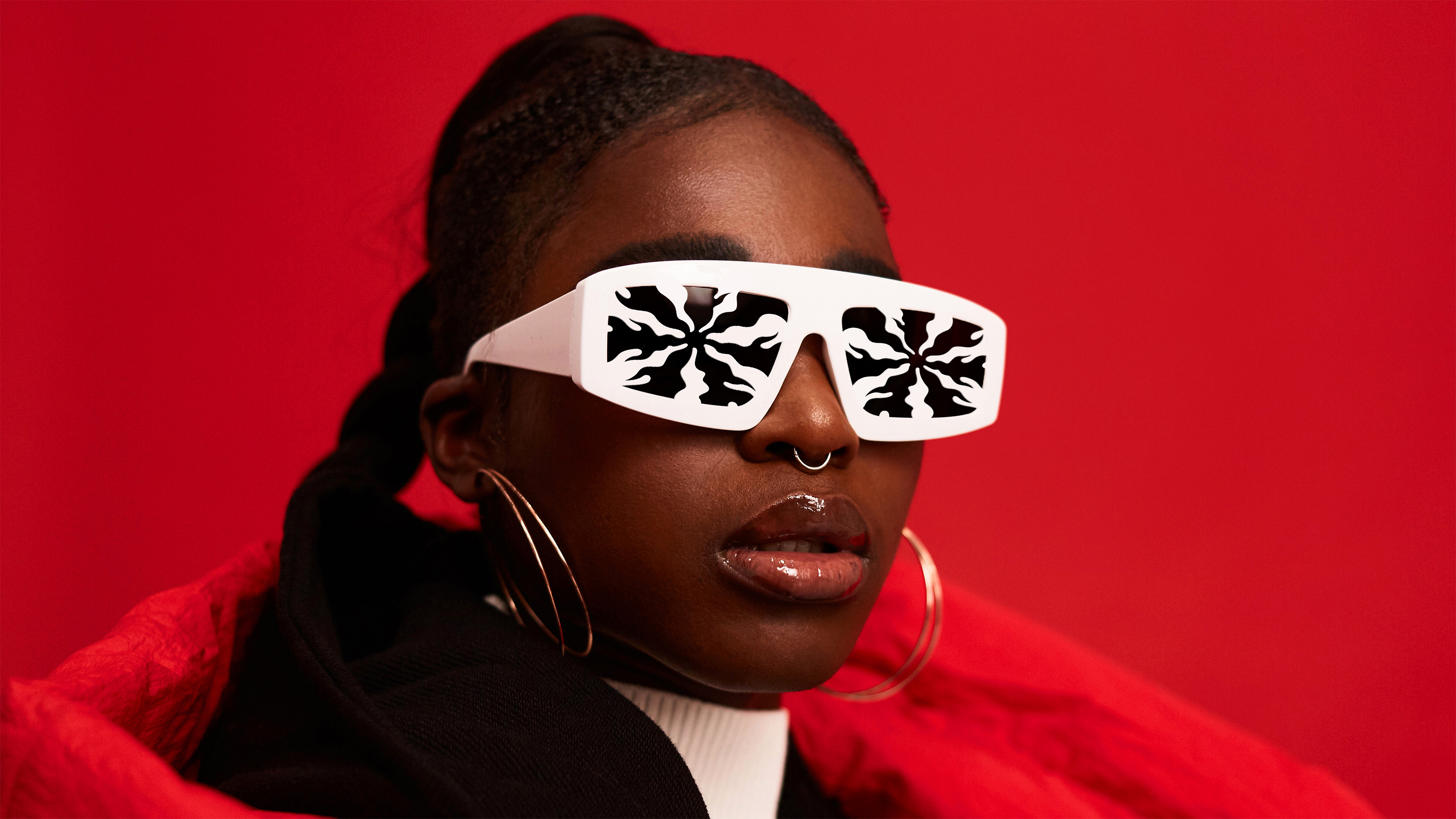
‘Chase the sun’ also informed our visual expression. We envisioned a system of bespoke suns inspired by each tournament destination, with seven rays that flex to represent the character of every host city, from the palm trees of LA to the desert of Dubai or the waves of Perth.
These ideas were paired with a bespoke, bold SVNS wordmark in a modular system designed to create consistency across the series while allowing each destination to express its own character. This sat alongside a dual colour palette contrasting a core SVNS black and white with a vibrant palette inspired by the colours of each location.
The typeface, Mabry Mono by Colophon Foundry, was selected as part of the system. Its modular, monospace structure with angular cuts and square features echoed the geometry of the wordmark and supported the flexible identity framework.
Our local approach also inspired one of the most distinctive elements of the brand exploration: the SVNS characters. As part of pushing the festival idea as far as it could go, we explored the creation of destination-specific mascots for the Series.
We partnered with 3D animation studio YONK to bring them to life. Each character was designed to represent the spirit, vibe and culture of its location. The individual city suns form the characters themselves, while cultural elements are expressed through outfits and accessories. This became a way to imagine how the identity could expand beyond graphics into personality, storytelling and fan engagement across the global tour.
SPECIAL THANKS
FURTHER
Lorenzo Di Cola
Vinay Mistry
Emily Jones
Sam Cornwall
Roshan Kumar
Chloe Jensen
Julien Poidevin
Adam Witton
Charlie Keeper
Kirsty Deacon
COLLABORATORS
YONK
Vincenzo Marchese Ragona


.png)