Forces at Play: Evolving a Brand While Honouring Tradition
.png)
Wimbledon is one of the most iconic sporting institutions in the world, what was the biggest challenge going into this project?
The biggest challenge was knowing that we weren't there to reinvent Wimbledon.
People already have a deep emotional connection to it, so the question wasn't "How do we make it different?" but "How do we make it feel even more like Wimbledon?"
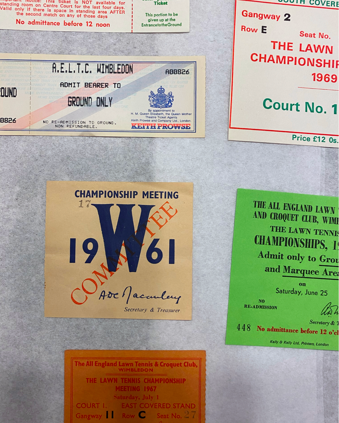
We spent a lot of time in the archive, around the grounds, talking to people and looking at details that most visitors never notice. The more we looked, the more we realised there was so much richness already there. Our job became bringing those qualities together into a clearer, more flexible identity that could work everywhere, while still feeling unmistakably Wimbledon.

You talk about "Forces at Play" as the central brand idea. Where did that come from, and how does it show up across the identity?
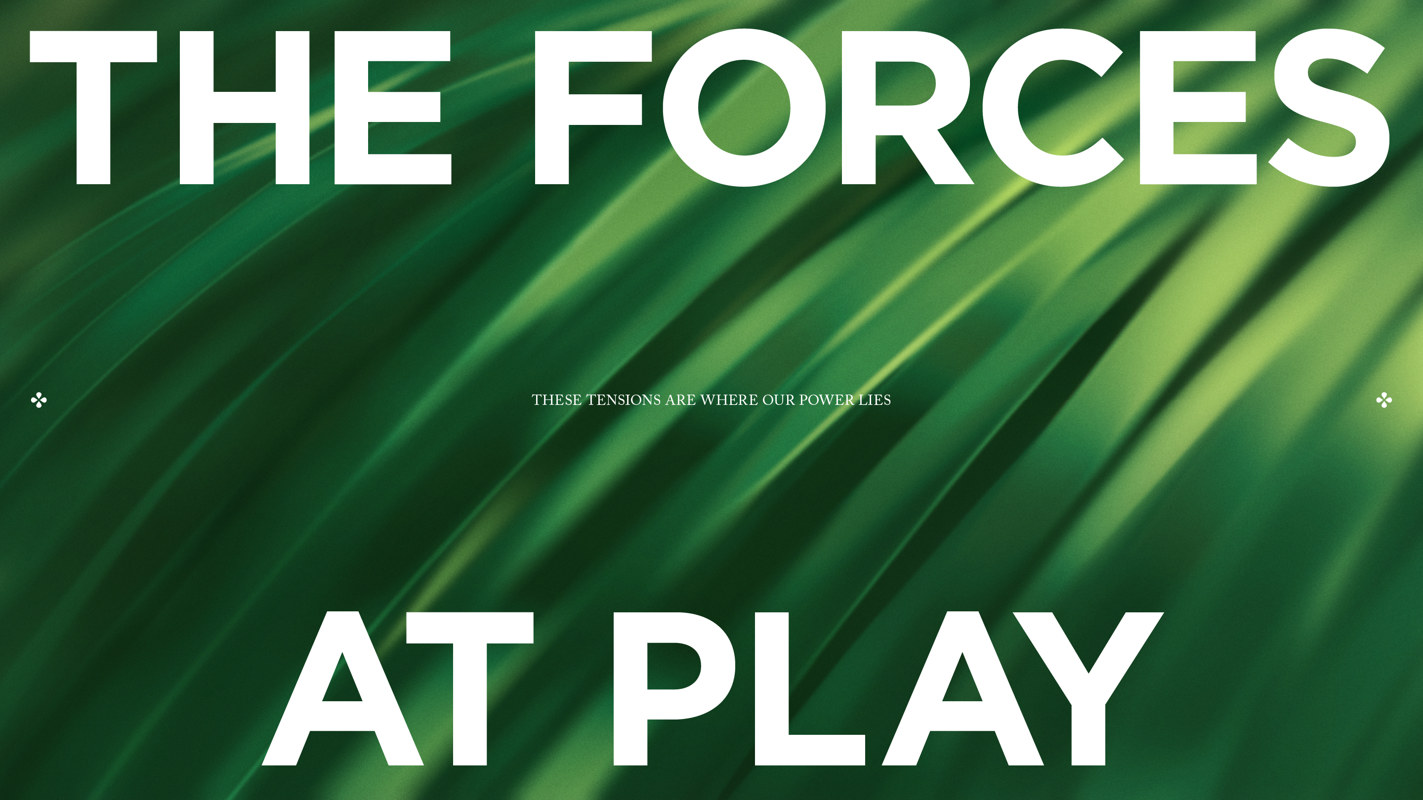
The idea came from something we kept seeing over and over again. Wimbledon is full of contrasts that somehow work perfectly together. It's incredibly calm, but also full of tension. It's rooted in tradition, but every year you see moments that surprise everyone. It's beautifully controlled, yet live sport is completely unpredictable.
"Forces at Play" became a simple way of describing those opposites. Once we had that idea, it helped guide lots of design decisions, from typography that could move between order and expression, to the expanded colour palette inspired by the grounds, to motion, graphics and layouts that could shift depeding on the moment. It wasn't just a line; it became a way of making decisions across the whole system.
How did you balance preserving Wimbledon's deep-rooted traditions while making the brand feel relevant to new audiences?
We tried not to think about tradition and modernity as opposites. The strongest parts of the Wimbledon brand are already timeless, so we wanted to build from those rather than replace them.
Instead of introducing something completely new, we looked for opportunities that already existed. The colours hidden in the landscape, the texture of the grass, the flowers around the grounds, the warmth of Wimbledon as a host, those became ingredients for a more expressive system. It feels fresh, but it's all rooted in things that have always been there.


How do you design for something as inherently chaotic as live sport?
That's actually one of the most exciting parts. Live sport never follows a script. One minute it's calm, the next it's one of the biggest moments in sport. We knew the identity had to be able to handle both.
Rather than creating something fixed, we designed a system that could stretch. It could feel quiet and elegant when needed, then become much more energetic during the Championships without feeling like a different brand. Good brand systems aren't rigid, they give you enough structure while leaving room for the unexpected. That's especially important for live sport.

Wimbledon has existed for nearly 150 years. What does it mean for a brand like this to evolve and how do you know when you've got it right?
For a brand like Wimbledon, evolution should feel natural. It shouldn't feel like a big reset. The best outcome is when people recognise something has moved forward, but it still feels completely authentic.
For me, we knew we were on the right track when every design decision could be traced back to Wimbledon itself. Nothing felt added for the sake of being new. The identity felt richer, more flexible and more confident, but still carried the same values and character that people have loved for generations. That's what good evolution should do.
.png)
Working on Wimbledon was less about designing a new identity and more about becoming careful custodians of one of the world's most loved brands. The best brand evolution doesn't ask people to see something new, it helps them appreciate what was always there. That, for me, is what made working on Wimbledon such a privilege.
View the whole case study here
.png)
.png)